Heading 1
Heading 2
Heading 3
Heading 4
Heading 5
Section Heading
Section Heading white
Re-usable panels
As a general rule everything is based on panels which can be dropped wherever. Because they can be put anywhere we need to have a little flexibility when they are placed.
All panels should have option of 'medium' or 'large' padding amounts (.padding-md .padding-lg), and the option to remove padding on 'top' or 'bottom' of the panel (.pt-0 .pb-0). This is because sometimes panels of the same colour will be above each other so we need to allow user to remove padding from one of them so they don't have huge gap between them. All this will be done by adding or removing classes on the panel.
The last high level options for panels would be when we use coloured panels. Need to be able to let user choose 'colour' of panel (colour classes shown above) and whether it has 'intro-copy' and CTA. Can all be done by adding/removing classes.
There's real examples in the below panels so you can see what I mean.
Icon spritesheet
Uses the class of .icon
New icons (October 2022 update)
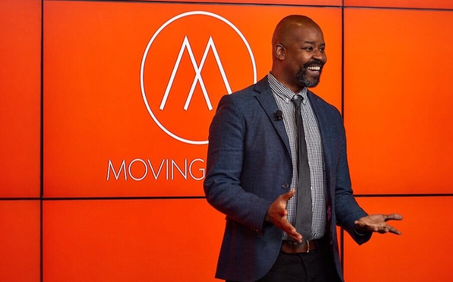
Video panel (sea colour with optional title bar and logo)
Optional panel subheading
Optional call to action
Video panel (with bullet boxes)
Optional panel subheading
- These bullet boxes only appear on the pricing pages, but you might want to allow option to add bullet list
- To make it easy we could just add three at a time and tell client they need multiples of three
- Then it should lay out ok whatever copy they put in here.

Testimonial panel
Occasionally (in fact only on pricing sub-page currently) you might get two panels of same colour above each other. To avoid them having a massive gap between them we should allow option to remove padding from top or bottom in widget options. We should also allow them to turn on and off background texture (like this panel here which doesn't have one)

Testimonial panel
Standard testimonial panel. Grey variant. The client needs to be able to choose background panel colour, and if they want a texture behind it. We can then change text colours based on their decision. In terms of imagery They should select a main testimonial image, and also company logo if they want one (that appears in the bubble) from media libraries.
Rated number 1 by our customers
We're top of the pile
I’ve used a range of audience response tools for university lectures, with mixed results. I’m happy to say all the events I have used Vevox for have gone brilliantly
I’ve used a range of audience response tools for university lectures, with mixed results. I’m happy to say all the events I have used Vevox for have gone brilliantly
I’ve used a range of audience response tools for university lectures, with mixed results. I’m happy to say all the events I have used Vevox for have gone brilliantly
I’ve used a range of audience response tools for university lectures, with mixed results. I’m happy to say all the events I have used Vevox for have gone brilliantly
Feature tabs
These tabs panels appear on home and feature pages. We just need options for user to add list item, and corresponding image
The image area uses repeatable markup you'll also see on the features pages. Also we have an option for user to choose an 'overlap' image as shown below in first tab (need to add a class to main image and the floating one). We should allow user to choose the height of the overlap image and the vertical position. We then apply that inline as shown in markup.
Lastly user should be able to choose a 'border shadow' in case they upload a white image which won't stand out against our white background.
feature/key signpost panels
These panels appear on features landing and it's subs, but also stories landing. They are supposed to be used for any content with accompanying image


Feature panel
feature subheading
Feature panel. This one has a .flipped class to switch the layout, as well as a class of .texture-right. Flipping the columns needs to be a user option. These panels are always white and always have a texture so no options needed there.
The image opposite also shows an example on white where we need the optional 'shadow-border' class. As long as we plumb in all these options we can re-use this panel style elsewhere.
Call to action

Heading
Optional subheading
Here you'll see we've got a bullet style again. User should be able to add this. It needs a class on it to work, as they aren't standard generic bullets used on content pages.
- .bullet-ticks .blue-ticks
- Bullet item
- Bullet item
- Bullet item
- Bullet item
Generic text + image panel with centred heading
This is a generic variant of the feature panel. It has a snazzy dropcap and is used for content heavy areas like on the about us page etc. It needs a background colour option a .flipped option. Based on the user choices we will then add the correct texture classes (left aligned, right aligned, texture opacity and colour etc).
I would treat this as a separate widget from the feature ones as it needs different options on it.
Here is a non-flipped version with different background colour
So when we change the panel colours we do need to change the texture opacity and colour. I think we should do this automatically when the user chooses a colour. and again that can all be done by swapping classes. It's all about putting the right options in the widget
Integrations panel. A one-off panel, so we just let them choose intro copy,images (although these are correct ones, they might want to add more), call to actions.
Optional subheading
Pre-footer panel
This will always appear above the footer and allow user to change copy, image and background (sea or sky). There should always be a Call to Action button.
Call to Action